
Selected work / 01Typography & culture
Lamu Typeface
A font inspired by Lamu’s architecture
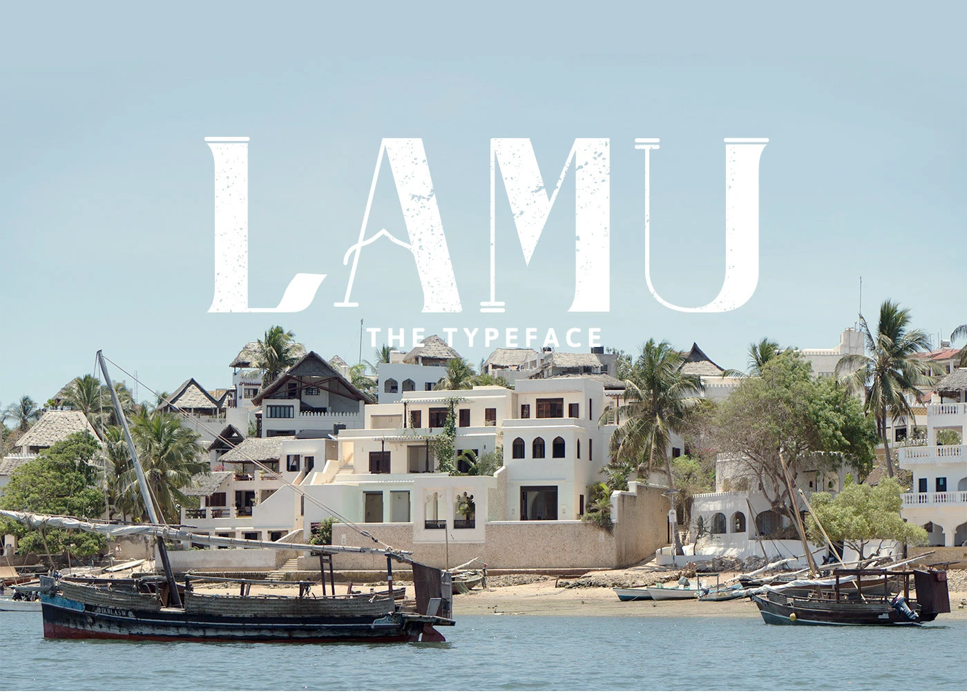
Lamu is an uppercase font inspired by the carved doors and architecture of Kenya’s Swahili coast. Its curved details and thick strokes are designed for titles and other large text.
The motivation
Drawing inspiration from Lamu’s architecture
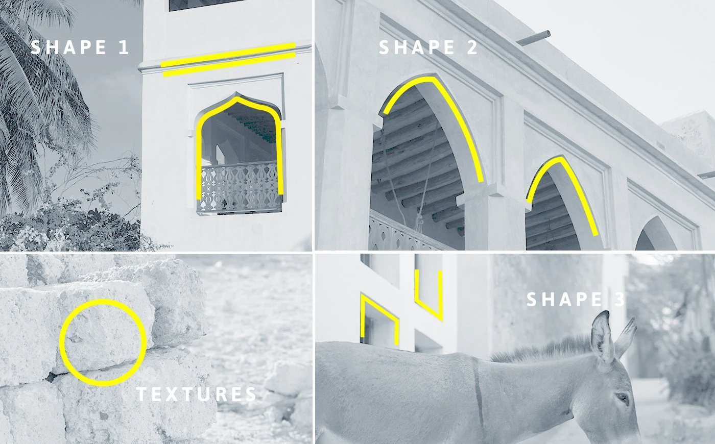
On a trip to Lamu, I was drawn to the carved wooden doors, stone arches and brass details. I wanted to explore how those shapes could become letters while keeping something recognizable from the buildings that inspired them.
The craft
Turning architectural details into readable letters
I worked through drawings of the letters, adjusting their curves and shapes to make them feel like part of the same family. I also checked the spacing between letters in different words so they would sit well together and remain easy to read.
I paired the font with photographs, textures and patterns from Lamu, alongside a short piece about the project. These show where the ideas came from and how the letters could be used.
The Typeface
Try the typeface
Try the Lamu font
An uppercase display typeface. Type below and explore its spacing, scale and colour.
Uppercase letters only · Click the specimen to edit
Bringing it together
Keeping Lamu recognizable in every word
The challenge was to make a useful font that still felt connected to Lamu. The architectural details give the letters their character, but they also need to work together in words the original drawings were never made for.
The text box above lets you try your own words and adjust the spacing to see how the letters work together.
- My contribution
- Typeface design, specimen artwork and writing.
- Explore
- View the original project ↗