Good evening
Today’s check-in
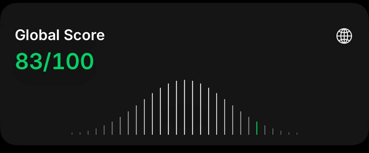
Global Score

The first hello
A springy drop, a little bounce and a golden glow.

Selected work / 07 Product design & development
Designing a social way to cut back on scrolling.
I built ScrollChamps around a daily check-in, personal targets and small groups of friends.
 ScrollChamps
Small wins.
Shared with friends.
Turning screen time into something people can work on together.
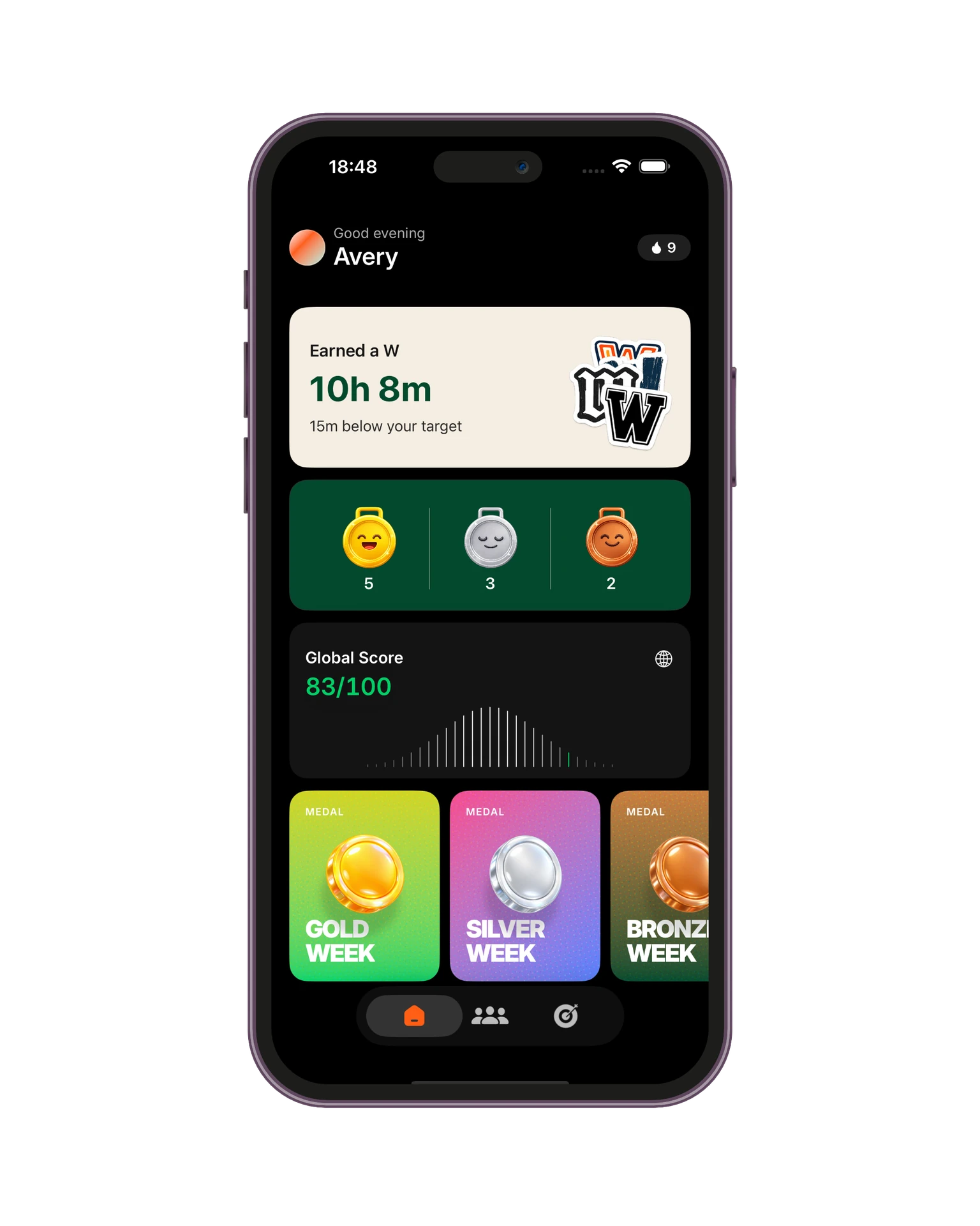
Our phones tell us how much time we spend on them. But a number on its own leaves a lot unanswered. Is it high compared with other people? Is it changing? What would a realistic improvement look like?
ScrollChamps grew around those questions. I wanted to explore whether curiosity and a little friendly competition could give people a reason to pay attention to their habits, and a more enjoyable way to work on them.
The app brings together a community comparison and small, private challenges. Global Score gives people context for their screen time. Groups give that curiosity somewhere to go: a regular check-in, encouragement from friends and a weekly result.
The interesting design opportunity was connecting the two. Discovering where you stand can get you interested; sharing progress with people you know gives the experience a life beyond that first number.
One important distinction emerged: using your phone less than someone else is not the same as improving your own habits. People arrive with different routines and reasons for being online. A simple ranking by hours would miss that.
That shaped the Daily W. Progress is measured against a personal target, then celebrated within the group. It lets the competition feel shared while keeping the challenge individual. The shared results show progress without putting everyone’s screen-time totals on display.
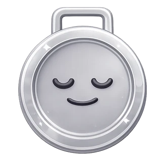
ScrollChamps needs enough personality to make people want to return, while keeping the task itself brief. I used expressive medals, playful artwork and reactions to make progress feel rewarding, with a short check-in at the centre of the experience.
The other challenge was making the comparison feel worth the effort. Submitting a screenshot asks something of the user. Clear guidance and a score reveal that answers the opening question help connect that effort to an understandable payoff.
Little interactions
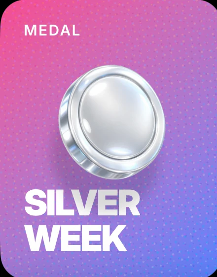
A win gets an entrance. A tilt gives it weight. Coming home gives it a tiny settling motion.
A springy drop, a little bounce and a golden glow.
In the app, the medal follows the tilt of your phone.
A small counter-swing, then a soft return to rest.
Interactive web studies of the app’s medal motion. The simplified screens place each interaction in its home-screen context.
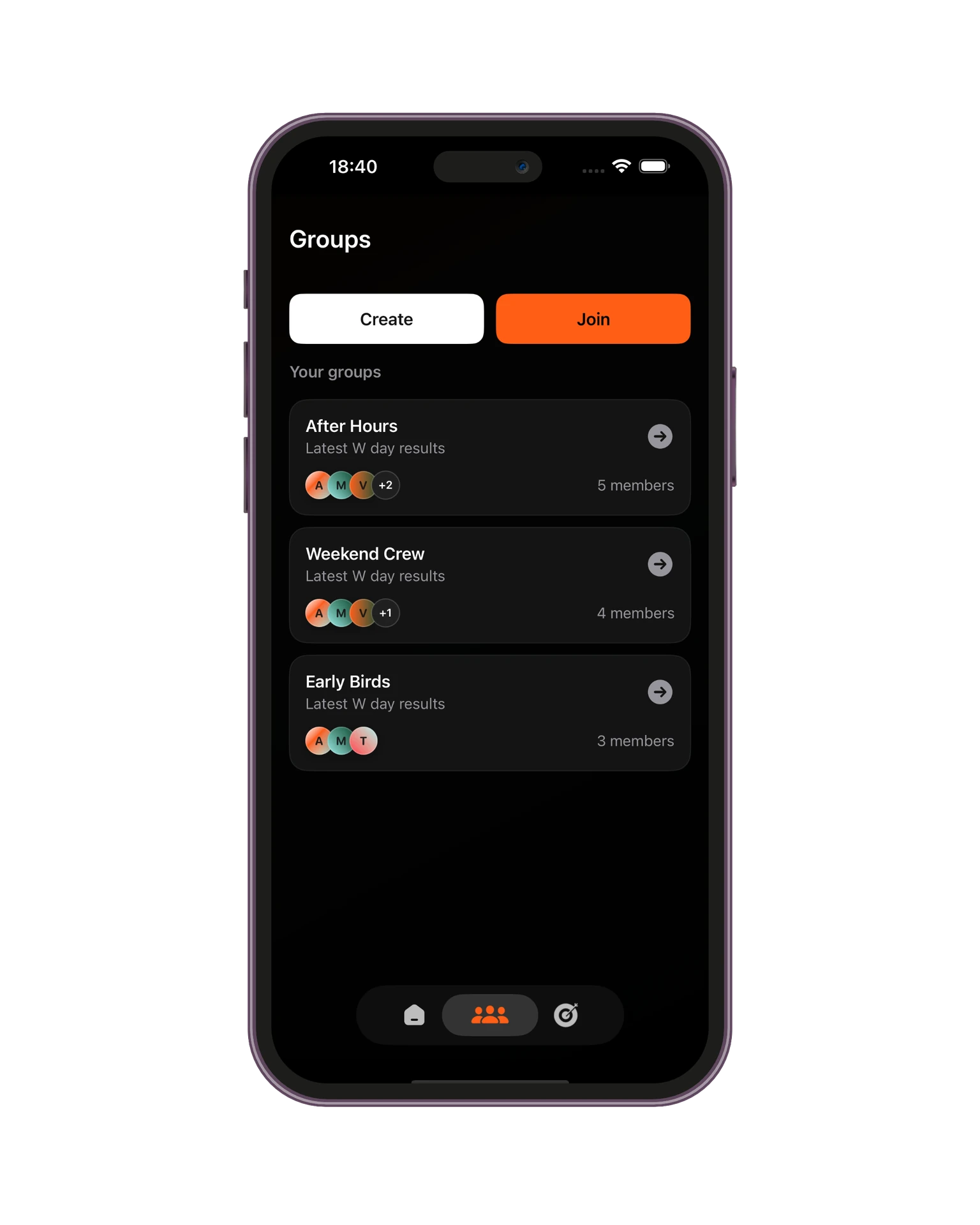




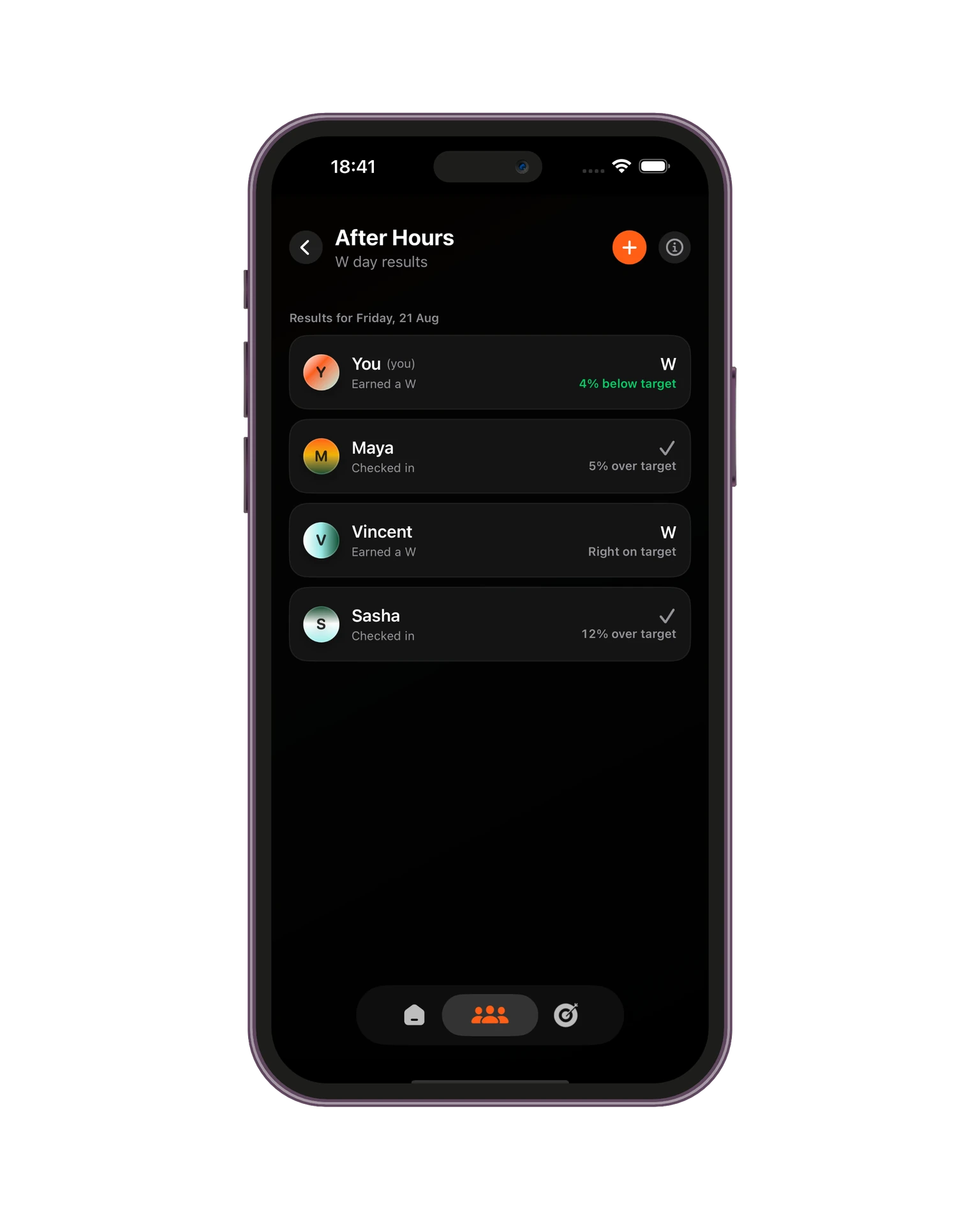

I took the project through concept, product design and development, building the iPhone app alongside its share extension and widgets. The work brought visual character, personal data and group behaviour into one experience.
The next stage is learning from a wider beta: whether people understand the comparison, how the challenge fits into daily life, and what makes a group keep going. Building an initial comparison sample is part of that work too. The product is built; its longer-term value is what comes next to test.